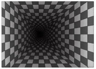
When planning a lighting design, safety is always a primary consideration. This consideration has to take into account the issues lighting can create not just the ones it can solve. Because of the way the human eye works, the design has to produce a uniform lighting coverage rather than just pockets of illumination because the light can play just as many tricks on the eyes as the shadows can.
The above illustration is a classic optical illusion and illustrates one of the concerns well. Our eyes perceive lighter colored areas as closer and darker colored areas as further away. We use light and dark as cues as to the surface texture and depth (Morris, 1996). While optical illusions can be interesting to look at, you really don’t want them as part of your lighting design. A dimly or erratically lit area can create disorientation in depth perception. This can cause the mind to perceive the area as a different depth than it actually is and that can cause a stumble or slip. If you add that slight depth perception issue to wet stone, irregular ground, or even steps you get a recipe for an accident.
Another issue is the eye’s ability to adjust between areas of high illumination and areas of little or no illumination. Going from a well-lit area to a dark area will create a few moments of night blindness and it only takes a split second of this to invite an accident (NSC, 2016). If you have ever stepped out of a well-lit area into the dark then you know how blinding it can be. Our eyes take a few seconds to dilate and adjust to the new level of luminosity, this is called darkness adaptation. Our eyes make use of the rods to detect light in lower levels of illumination rather than the cones they use when there is greater brightness (Caruso, 2007). The lighting design should graduate between the well-lit to the lower ambient lighting so that someone walking at night will have a progressive adjustment to their vision rather than dramatic and sudden changes. By decreasing light levels in stages, it gives the eye time to adjust as the person moves. Using intermediate lighting between bright illumination and ambient areas allows an easy and natural adjustment period for the eye and reduces the risk of unexpected momentary blindness.
Along the same lines, the use of heavy lighting in one area can create blind spots in unlit areas adjacent to them. Without a uniform lighting you can end up with areas of shadows that can be accident prone or worse, areas that are hidden. Spotlighting a property can create areas of radical eye adjustment and increases the risk of accidents rather than reduce them. A study showed that spotlights can create areas useful to thieves in that the blinding light in one area creates a haven for them in another adjacent to it (NSC, 2016). Since the eye can only adjust to one lighting level at a time it adjusts to the brightest level leaving the darker areas around it indiscernible and a potential safety concern. The use of dark can create dramatic effects and is useful in the aesthetics of creating a lighting design. However, those areas though have to be planned out to make sure they do not create areas where accidents can happen or that can be utilized by potential intruders. That is why we consider the whole property when creating a lighting design, so that we create the drama without accidentally creating risks.
A lighting design should use graduated lighting schemes, overlapping luminosity, and consideration for any uneven or textured areas it covers. It should take into account areas of vulnerability of your property as well as areas you wish to highlight and showcase. Without taking all of those things into consideration a lighting design can actually create safety issues rather than solve them.
[sgmb id=”1″ customimageurl=”” ]
Caruso, R. (2007) Scientific American, August, 2007
Morris, R. C. (1996) Shadows and Depth Illusions. Perception. August 1996. 25: 927-929
NSC (2016) National Safety Council. http://www.nsc.org/


